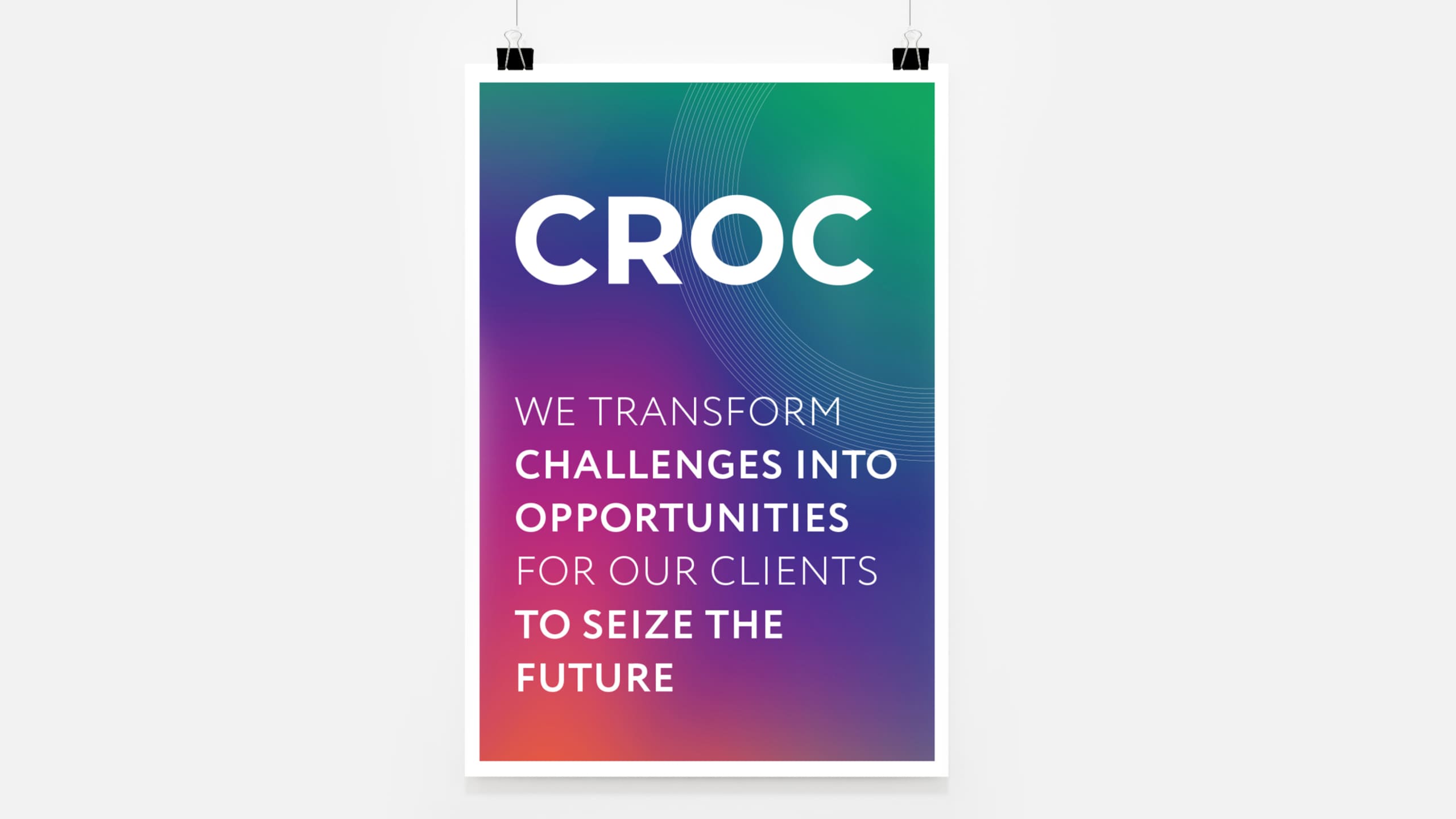
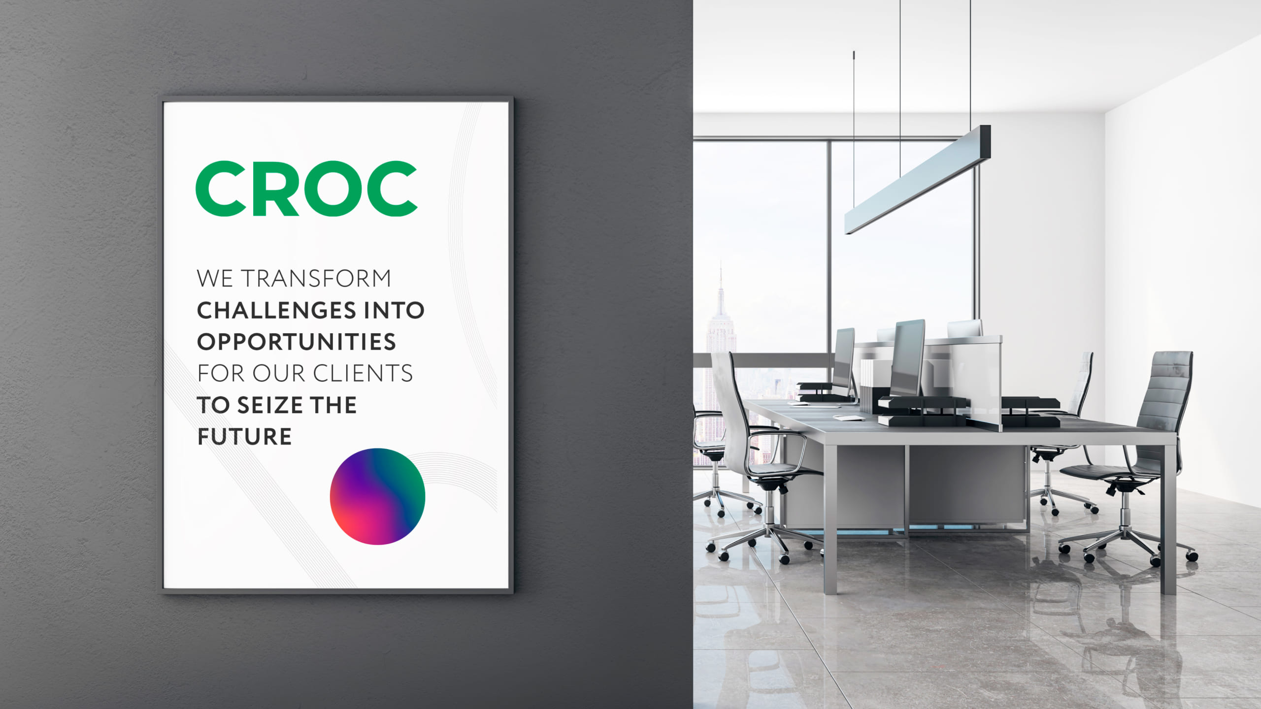
These are key guidelines that will help you tell the CROC brand story and deliver the genuine CROC experience. When you are designing for CROC, your story should follow the basic set of rules:
Be simple and clear. Be approachable and relevant. Stand out and surprise.
Our visual language is adaptable, and these guidelines will help you implement CROC’s identity and tell an exciting story inside and outside of the company in a consistent and inspiring way.
Our logo is the basis of our brand universe.
We have used the CROC wordmark for many years. It signals consistent foundation, reliability and simplicity.
We retain the equity of logo heritage and reinforce its uniqueness in the digital age. When used right, the logo works across different applications and at different scales.
We have been a technology integrator for decades now. As we grow and move forward, our brand evolves with us and the message is realigned to match the new world we live in and to capture our vision and goals.
We aspire to be the company that integrates the future for its customers. This is how we want people to perceive us and experience our business.
Our brand stance is expressed in a clear idea: We integrate the future.
Our layout system is simple and straightforward in its use. The CROC logo “O” is used wherever it appears. By defining a grid based on a circle, the system remains adaptable and elegant.