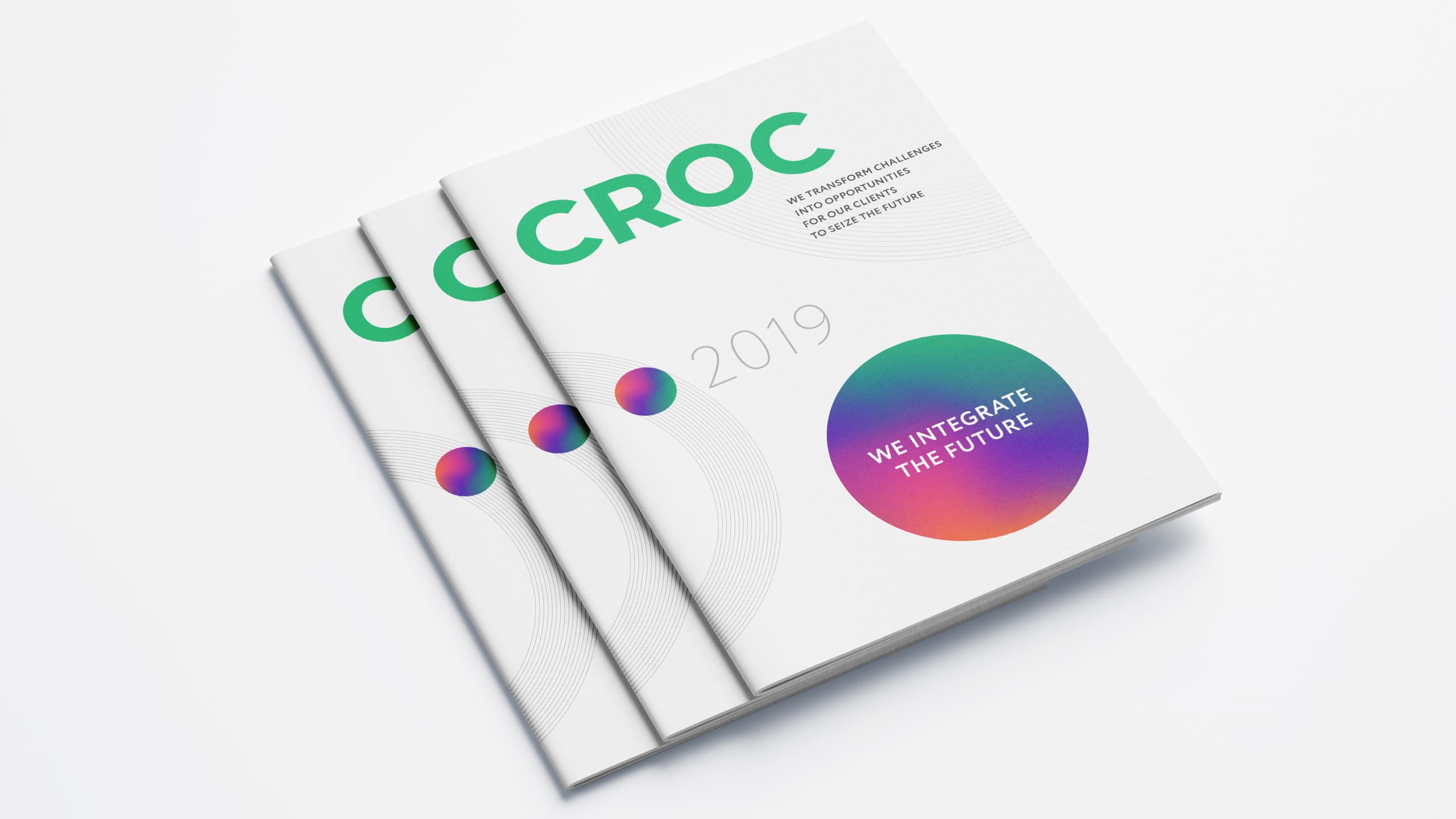
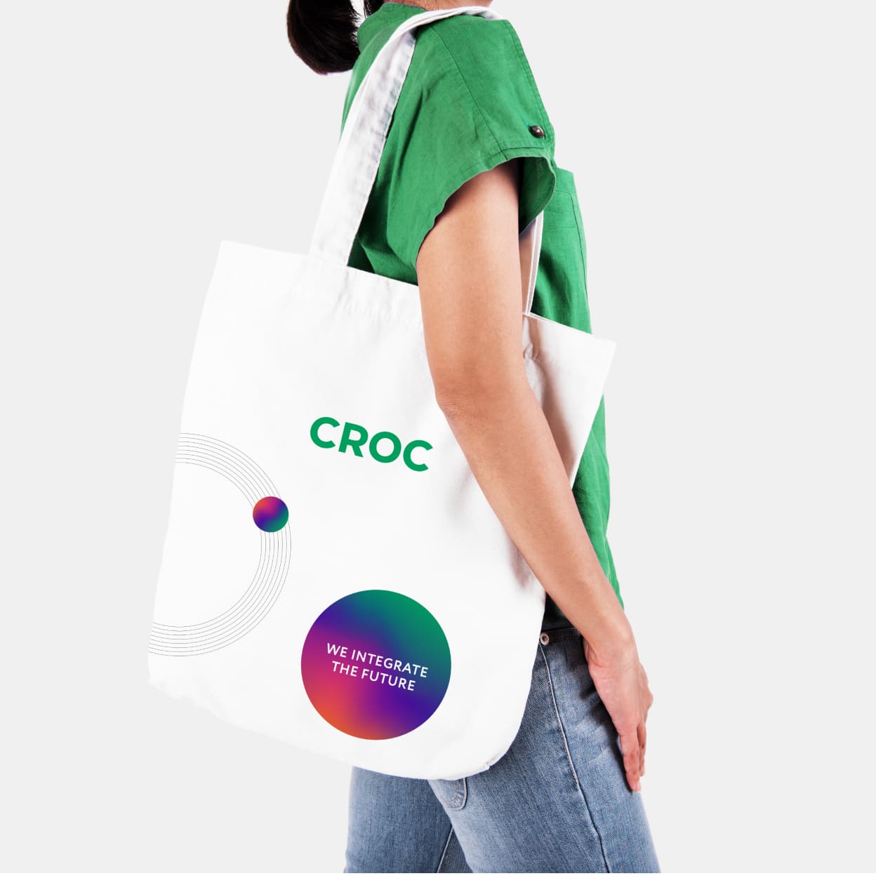
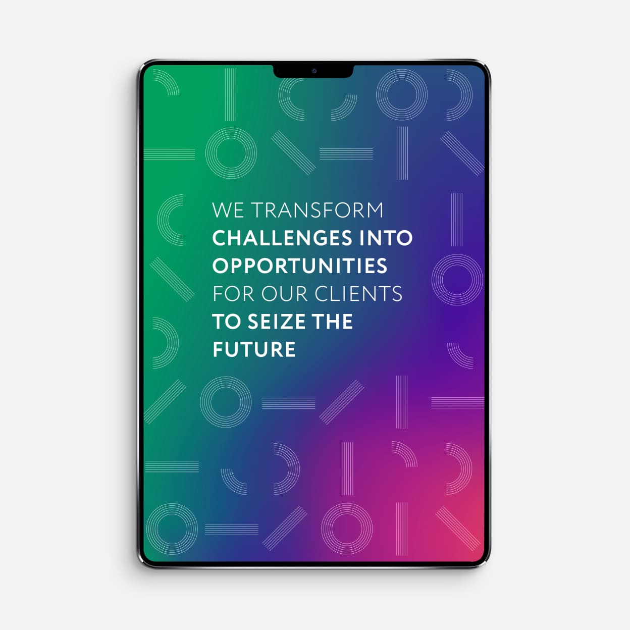
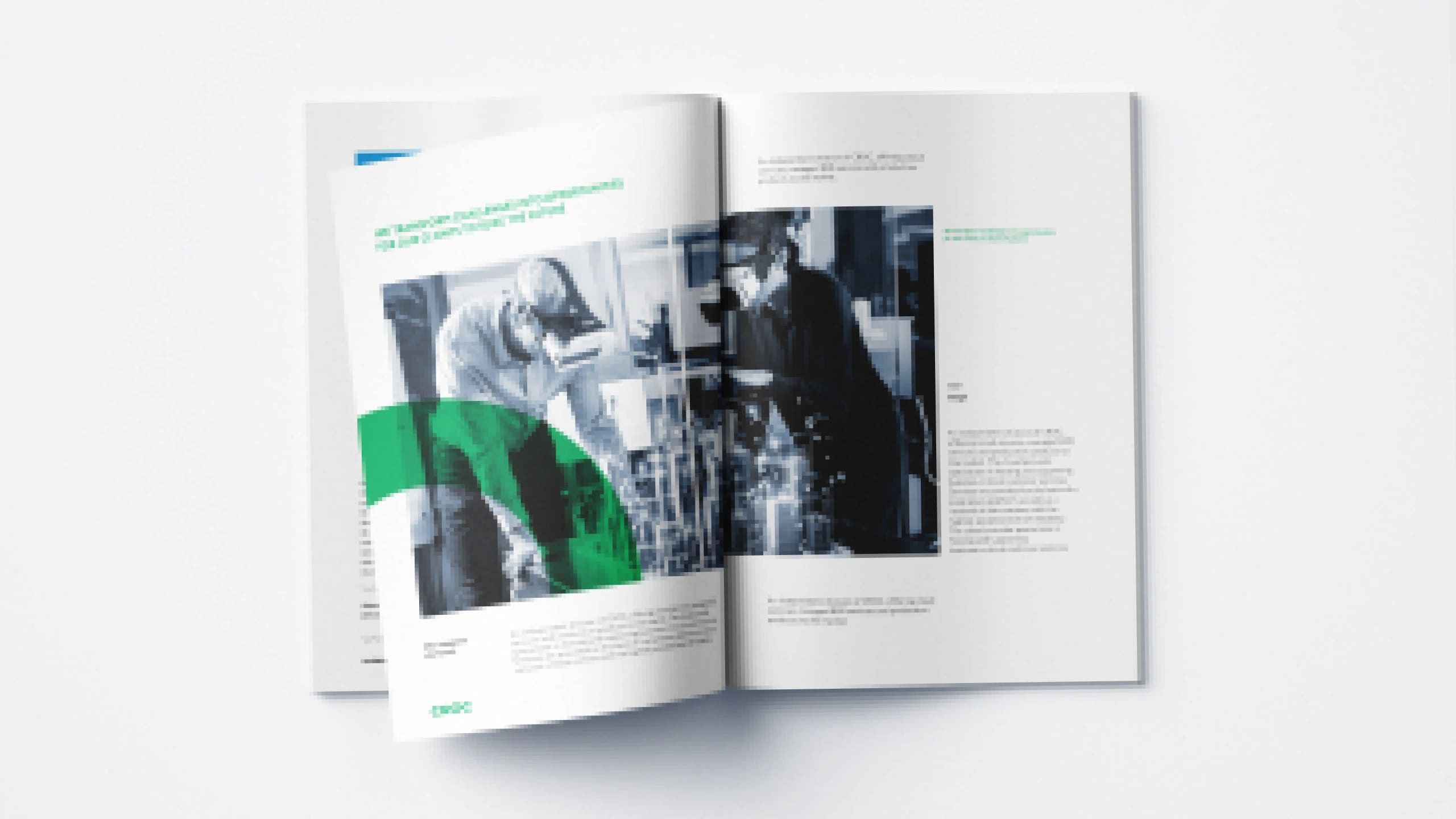
The CROC visual system makes use of contemporary user interfaces that are airy and bold in the use of color, typography, photography, iconography, and data visualization elements. These are present in every medium. In this guide we provide an overview of principles and show how to apply them in the world of CROC
Remember two main rules: know your viewer and stay creative. Our brand system is flexible enough to adapt to swings in tone, while retaining brand consistency across every touchpoint.
Color is a fundamental tool in communicating the CROC brand. The visual language features three primary colors and four secondary colors. These have been optimized for digital, and the identity also retains CROC’s distinctive green as a primary color.
Green and neutrals form the core, while secondary colors are used for accent and highlights. Color combinations should be balanced and clearly communicate the innovative energy of the CROC brand.
The extended color palette introduces branded gradients that highlight CROC’s dynamic visual personality. Getting the CROC’s unique Mesh gradient right was a challenge for the designers, requiring many tests to find the perfect shades that work successfully across multiple applications.
You can use them to add depth to a flat design or as an overlay to add visually compelling hits of color to a plain background. But keeping balance is key when creating a combination of colors. Final design must always be easy to read.
Our typography is as distinctive and easy to use as we are. Our typography enables users to have a seamless experience at all the touchpoints with CROC products and solutions.
The lettering is faithful to the spirit of the original logo and is important to get right to further communicate the CROC brand. The primary font is Croc in all styles – depending on the application and medium. Also an additional Open Sans font is used.
Icons are paired with words to visualize a text message. They should be selected on the basis of context. The arrangement of the icons with the text block is left aligned or centered depending on the justify mode. Also, the icon can be used without text at different scales.
Primary brand colors are used for type. On a white or light background, text should be dark gray or black. You can use green and blue for emphasis, headings and subheadings, intro or quotes. Additional colors are used less often, mostly to divide and label information. By adding color into typography you should clarify informational hierarchy and organization and elevate your communication style.
Croc Bold is used for headings. The size depends on the nature of the message and the composition. Headings can be centered or aligned to the left, keeping approximately the same margins left and right. On wide formats the heading is placed on the left side. The proportions between the size and leading should be done proportionately, for example, 24pt / 28pt. If the size exceeds 72 pt, use the same spacing as the text size 72pt / 72pt.
Croc Regular, Light - the main font used for text blocks. For subheadings, Croc Bold is applied, in smaller sizes relative to the heading. The text box must be centered or aligned to the center on the page. Left and right margins should have the same width, for example, 11pt / 15pt. A successful hierarchy uses a small set of size and weight combinations to both create points of focus and outline the typed content in an easily scannable structure. When in doubt, avoid the strong style.
Evolved from the company’s iconic logotype, patterns are comprised of one of the basic geometric element – a line – that can be extracted and used as a graphic element.
These elements epitomize a company that while remaining faithful to its core principles, is always expanding and moving forward. Activating the linear patterns within the CROC logo brings a dynamic graphic energy to the brand.
Geometry and clarity confirm the company’s technological DNA, evoke connectivity and form the basis of a system of customized patterns, illustrations and themes with lines that resonate the shape of the logotype, conveying a strong sense of connectivity and movement.